One of the essential components of running a successful PPC campaign is making sure you build out relevant landing pages. Better yet, you need to develop landing pages that align with your ad campaign. This is because landing pages are often the initial touchpoint a potential customer has with your brand. That being said, it is vital that your landing page experience makes a great first impression and provide a great overall experience for the user.
Whether it be message matching and fluid navigation, or originality and trustworthiness, you need to optimize both your landing pages and PPC ads. You need to design your assets so that they work in tandem and complement one another. Here are four methods you can consider to optimize your PPC campaigns and provide a stellar landing page experience.
Keep Your Message Clear and Consistent to Provide a Great Landing Page Experience
While this may seem obvious, it’s amazing how often ads dong align with their corresponding landing pages. Whenever you run a Google Ads campaign, make sure your promotion remains consistent throughout your entire process. This concept is known as message matching.
If your PPC advertisement is promoting a free trial, then your landing page should also feature a free trial. If your PPC ad promotes a white paper, then the corresponding landing page should also highlight the same white paper. The language and tone should also remain consistent between the advertisement and the landing page. This sort of message matching consistency helps reinforce positive a positive landing page experience, which is a variable Google takes into account when calculating your Quality Score.
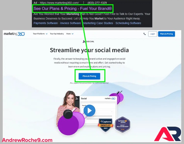
In the sample below, we did a basic google search for “social media marketing.” You’ll notice how in this basic example Marketing 360 offers a clear, concise, and consistent message in both its PPC and its landing page. In both examples, the consistent theme is “plans & pricing.” Furthermore, you’ll notice a series of four extensions (the blue text beneath the ad copy) in the PPC ad. While this is awesome to see as a marketer, the language does not carry over to the landing page.

Call-t0-Action
The CTA on your landing page needs to be painfully clear and directly related to the next step. In fact, A/B testing has shown that by changing your CTA copy – even by just one word – you can increase your conversion rates by 161.66%.
That being said, it’s critical that you invest an adequate amount of time into making sure your landing page CTA is easy to spot and painfully clear.
A few simple ways to improve your landing page CTA include:
- Placing your CTA in a spot where visitors are sure to see it (aka above the fold).
- Designing your CTA button in a color that contrasts with the rest of your page.
- Using actionable language, such as “Save More Money Today!”
Use Original & Engaging Content on Each of Your Landing Pages
Originality
This shouldn’t come as a surprise, but people don’t want to see the same content on all of your landing pages. This gets boring really fast. Rather than copying and pasting your content from one landing page to the next, try creating new content for each of your landing pages. Remember, you should strive to make each page unique and specific to the corresponding ad. You can differentiate your pages by providing different information on each page that both Google and your customers will find appealing. Doing so will add value and recognition to your ads.
Engagement
If you’re going about your PPC campaigns the right way, you’re sending prospects to a landing page that’s designed to convert paid clicks into customers. This is also where you can make an indelible first impression with prospective customers. There are a number of ways you can go about doing this:
Speak to your visitors in a friendly tone
You need to welcome your visitors with open arms in both your PPC ad and landing page copy. Remember, you want your PPC ad and landing page to be relevant and provide the same message. When writing your copy, pretend that you’re speaking to someone in your ideal target audience in-person rather than online. Doing so will help your copy sound more natural, which in turn, makes it easier for prospects to engage with you.
Use numbers, bullet points, and other easily digestible content
People clicking on PPC ads don’t have the patience to read long-form copy. They want to skim and scan in hopes of finding exactly what they’re looking for. The simpler your message, the more your visitors will engage with it. This, in turn, results in more conversions.
Consider adding a splash page
**This only applies if you must link your PPC ads to your website or homepage.**Unlike a squeeze or landing page, splash pages don’t necessarily ask visitors to enter any personal information. The primary purpose of a splash page is to simply inform visitors of something, like a major update, or share something with them, such as an existential quote. In short, the ultimate goal of a splash page is to make it easier for your target audience to engage with your brand and click-through to your page.
Splash Pages
Below is an example that Football.com implements on their website. If you link to your website from your PPC ads, it is critical that you incorporate some sort of device that will take visitors to your primary site. However, you can also use a splash page to guide visitors to your landing page with a redeemable offer.

Explain Your Unique Value Proposition Right Away
Let’s be real…sometimes you have to brag a little bit. Tell your potential customers why you’re the best option among a sea of competitors. You need to use straightforward language and convincing selling points on both your PC ad and landing page. If you do this successfully, you’ll increase your ROI and improve your overall PPC efforts.
Does your service offer a free trial with no credit card required? If so, make this clear in your ad and on your landing page. Does your company regularly rank towards the top of its industry? If so, make this painfully clear in your ad and on your landing page.
Incorporate Trust Signals
It is critical for any business to establish an emotional connection of some sort in order to convert prospects into customers. In order to accomplish this task, you need to incorporate trust signals into your PPC ads and landing pages.
Trust signals are a hallmark of effective landing pages and they can come in a variety of different forms. Two of the more common forms of trust signals are contact information and social proof.
Contact Information
Hiding contact information from customers can come across as untrustworthy. You need to clearly share your contact information and make your business easily accessible. However, you don’t want to clutter your page with unnecessary clutter can be distracting. Listing your phone number is a great idea since it shows that your business is legitimate. Furthermore, make your phone number click-to-call so that it’s even easier for visitors to convert on your landing page!

Social Proof
Social proof is any sort of review, ratings, or testimonials from previous or current customers. Providing genuine endorsements is a great way to validate your ad, landing page, and overall trustworthiness of your brand. It’s difficult to include a full review in a standard PPC ad. However, you can most definitely tease prospects with a brief snippet.
What Does Your PPC Ad and Landing Page Process Look Like?
It’s essential that your message in your PPC ad and on your landing page sync up. This is one of the easiest practices to follow. Furthermore, it also improves user experience and increases your landing page conversion rates. This is because a great first impression – the combo of your PPC ad and your landing page – gets people to take action.
Closing Thoughts
The more you can implement the tips we’ve covered above, the more you’ll smile when you review your analytics and metrics!


